EzPzCode
EzPz Code provides adaptive IT maintenance and infrastructure management solutions designed to ensure system stability and security.
The company helps businesses keep their digital environments efficient and protected while staying aligned with evolving objectives. With EzPz Code, maintenance becomes effortless and reliable, allowing teams to focus on growth and innovation.


My Key Contributions to the Project
Instant results, Zero Wait
After conducting interviews with both potential and current users, I analyzed their responses and identified the main interaction patterns and expectations.
Based on these insights, I designed a set of monochrome wireframes for the website and multi-step user form.
These low-fidelity layouts allowed us to quickly test structure, validate flow logic, and collect early feedback before moving into the visual stage.
This process helped the team align on the overall direction and ensured that the foundation of the product was both functional and user-centered.

Say Goodbye to Rigid Staffing
Once the project’s scope, audience, and tone were clearly defined, I began working on the brand identity.
This included developing a cohesive color palette, designing the logo, and establishing the visual language that would carry across all digital assets.
Through several iterations, I explored different stylistic approaches to find the right balance between modern aesthetics and business credibility.
Additionally, I created early concepts for the landing page’s first sections to demonstrate how the visual identity could work in a real interface context.

Cost-Effective Expertise
Given the project’s tight timeline, efficiency was crucial.
To save time while maintaining high quality, I selected and adapted pre-built animation solutions from Webflow libraries.
This allowed me to enhance the overall interactivity and visual engagement of the landing page without extending the production timeline.
By fine-tuning transitions and microinteractions, I achieved a dynamic and polished look that matched the brand tone - while keeping the process within budget.

Ultimate Plan Flexibility
After approving the animation direction, I refined the wireframes and began transforming them into full-color, high-fidelity interface designs.
Every visual element - from typography and spacing to icons and hover states - was carefully adjusted to create a cohesive, accessible, and engaging user experience.
I also paid special attention to the responsiveness of the layout, ensuring that the interface remained consistent and functional across all screen sizes and devices.

Skip the Meetings, Start Doing
When the design was finalized, I prepared detailed specifications and assets for the development team, covering all responsive breakpoints and components.
Throughout the handoff phase, I provided ongoing support, answered technical questions, and reviewed the implementation to maintain design accuracy.
After development was complete, I conducted interface testing to ensure visual consistency and usability before the project’s official launch.
This final stage ensured a seamless transition from design to production and a stable, user - ready result.

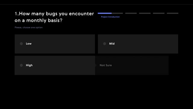
Wireframe Design
After conducting interviews with both potential and current users, I analyzed their responses and identified the main interaction patterns and expectations. Based on these insights, I designed a set of monochrome wireframes for the website and multi-step user form. These low-fidelity layouts allowed us to quickly test structure, validate flow logic, and collect early feedback before moving into the visual stage. This process helped the team align on the overall direction and ensured that the foundation of the product was both functional and user-centered.
Concept & Branding
Once the project’s scope, audience, and tone were clearly defined, I began working on the brand identity. This included developing a cohesive color palette, designing the logo, and establishing the visual language that would carry across all digital assets. Through several iterations, I explored different stylistic approaches to find the right balance between modern aesthetics and business credibility. Additionally, I created early concepts for the landing page’s first sections to demonstrate how the visual identity could work in a real interface context.
Animation Setup
Given the project’s tight timeline, efficiency was crucial. To save time while maintaining high quality, I selected and adapted pre-built animation solutions from Webflow libraries. This allowed me to enhance the overall interactivity and visual engagement of the landing page without extending the production timeline. By fine-tuning transitions and microinteractions, I achieved a dynamic and polished look that matched the brand tone - while keeping the process within budget.
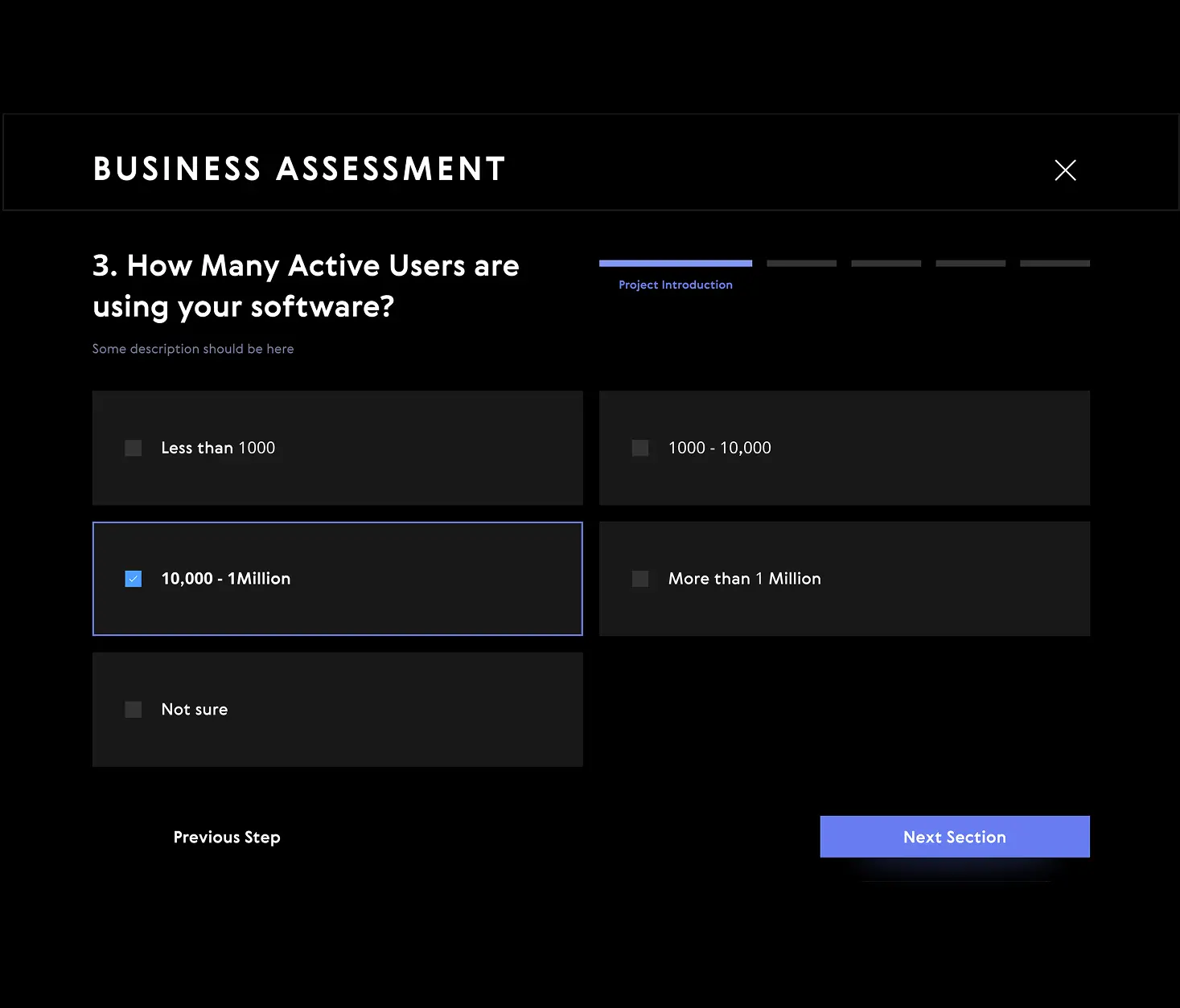
Interface Design
After approving the animation direction, I refined the wireframes and began transforming them into full-color, high-fidelity interface designs. Every visual element - from typography and spacing to icons and hover states - was carefully adjusted to create a cohesive, accessible, and engaging user experience. I also paid special attention to the responsiveness of the layout, ensuring that the interface remained consistent and functional across all screen sizes and devices.
Implementation Supervision
When the design was finalized, I prepared detailed specifications and assets for the development team, covering all responsive breakpoints and components. Throughout the handoff phase, I provided ongoing support, answered technical questions, and reviewed the implementation to maintain design accuracy. After development was complete, I conducted interface testing to ensure visual consistency and usability before the project’s official launch. This final stage ensured a seamless transition from design to production and a stable, user - ready result.
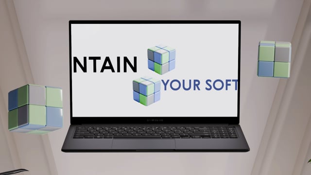
The visual idea was to express simplicity and lightness in a context of complex, intellectual solutions. As a symbol, I chose the Rubik’s Cube - it represents both a playful childhood toy and a challenging puzzle that requires logic, precision, and speed. This duality perfectly reflects the company’s philosophy: turning complex digital challenges into clear and accessible solutions.
The main goal of this project was to explore the market and evaluate the viability of a new business idea.
The client - an established IT studio with a large development team- aimed to test a different business model and present their concept to potential partners and investors.
To achieve this, I designed and developed a website that would serve as a research and validation tool. It helped collect insights, observe user behavior, and measure the level of interest in the proposed service.The testing phase lasted over a year. During this time, the team gathered valuable data, analyzed performance, and refined the idea.
Currently, the company is undergoing internal transformation, rebranding, and adapting its structure to align with the new business direction.
.webp)
Rapid Development
Time was critical - the project moved from concept to delivery in record time to ensure a timely market launch.
SCROLL
1.Research & Interviews
Conducted user and client interviews, analyzed feedback, and created initial project documentation to define key goals and requirements.
1 week
2.Landing Design
Developed the landing page - from wireframes to final visuals, ensuring smooth collaboration throughout the development process.
3 weeks
3.Form Development
Designed a multi-step questionnaire that enables sales managers to collect essential client data for effective follow-up.
2 weeks
4.Technical Onboarding
Fast Launch. Quick design and development turned an idea into a ready product.
.svg)
.svg)
The reference to speedcubing competitions also aligns with business values — where speed and accuracy are key to success.
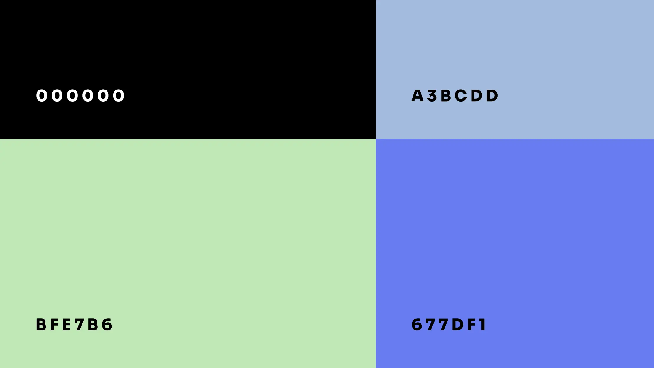
The chosen color palette conveys freshness, youth, and clarity, contrasting with the darker, tech-heavy aesthetics often used by competitors. This approach allowed the design to stand out while maintaining a sense of openness and trust.
Since the company offers package-based solutions, I designed clear pricing sections to emphasize transparency. Each page includes strong calls to action, encouraging users to contact the team for a personal consultation.
.webp)