MedMind
MedMind is a user-friendly e-commerce platform that helps people access essential medications at affordable prices.
By partnering directly with manufacturers, the service eliminates unnecessary markups and ensures transparent, cost-effective access to treatments. In the future, the platform will feature AI-powered assistance to help users find the right medications and related products with ease.


.jpg)
& Contribution
I was responsible for initiating the design process from early discovery to the first visual concept. My tasks included defining the visual direction, aligning it with the brand identity, and creating a design system for scalability. After shaping the core concept and design approach, I handed over the project to the design team for further development and refinement.

From Insight to Impact: Building a Foundation for MedMind's Success
Step 1: Competitor Analysis
I began with a detailed analysis of five key competitors in the pharmaceutical and supplements e-commerce space. This helped identify strengths, weaknesses, and opportunities for MedMind’s positioning.
Step 2: Wireframe Development
Based on the research, I created low-fidelity wireframes to map out user journeys, prioritize usability, and define the app’s structure.
Step 3: Design Concept for Investors
I crafted the visual concept and initial design presentation to showcase the brand's vision to stakeholders and investors — setting the tone for the platform's future look and feel.
Step 4: Handoff to Design Team
Once the concept was approved, the project was passed on to the product design team for further development and scaling across all screens.
Step 5: Marketing Assets
In addition to the digital design, I created visual materials for marketing including printed packaging inserts and delivery cards that accompany supplement shipments.
The project is currently still in active development and design. Stay tuned for more updates!
.webp)
.webp)
.webp)
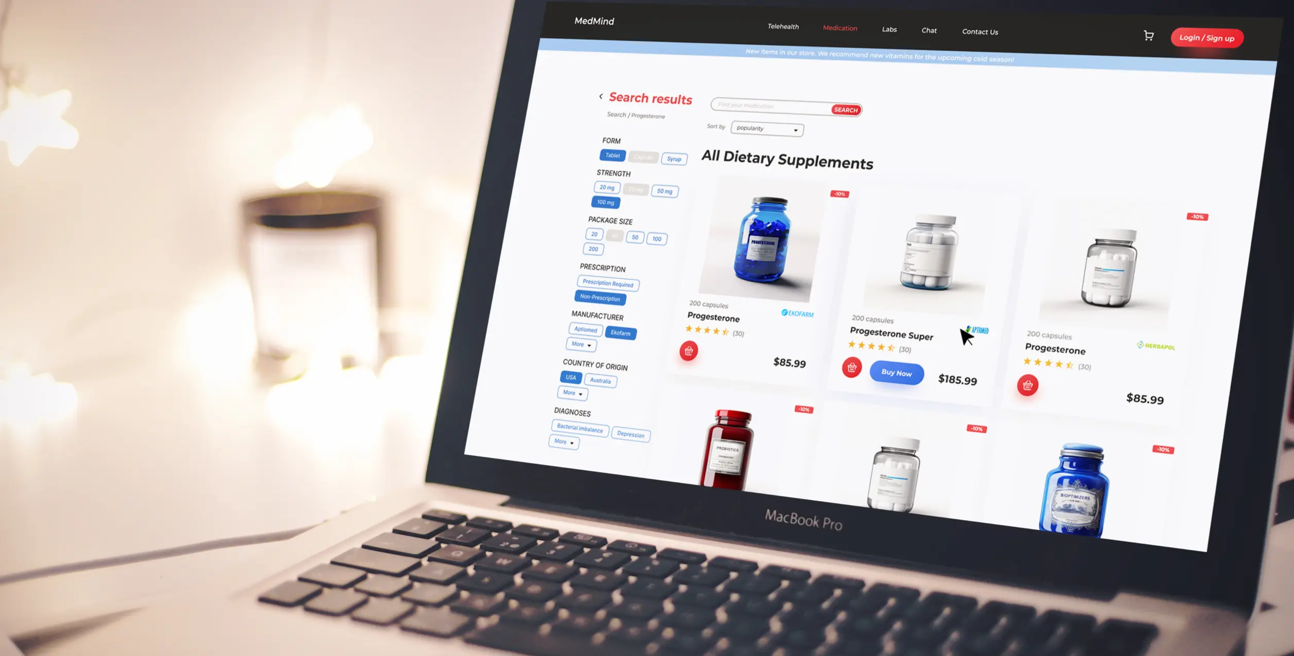
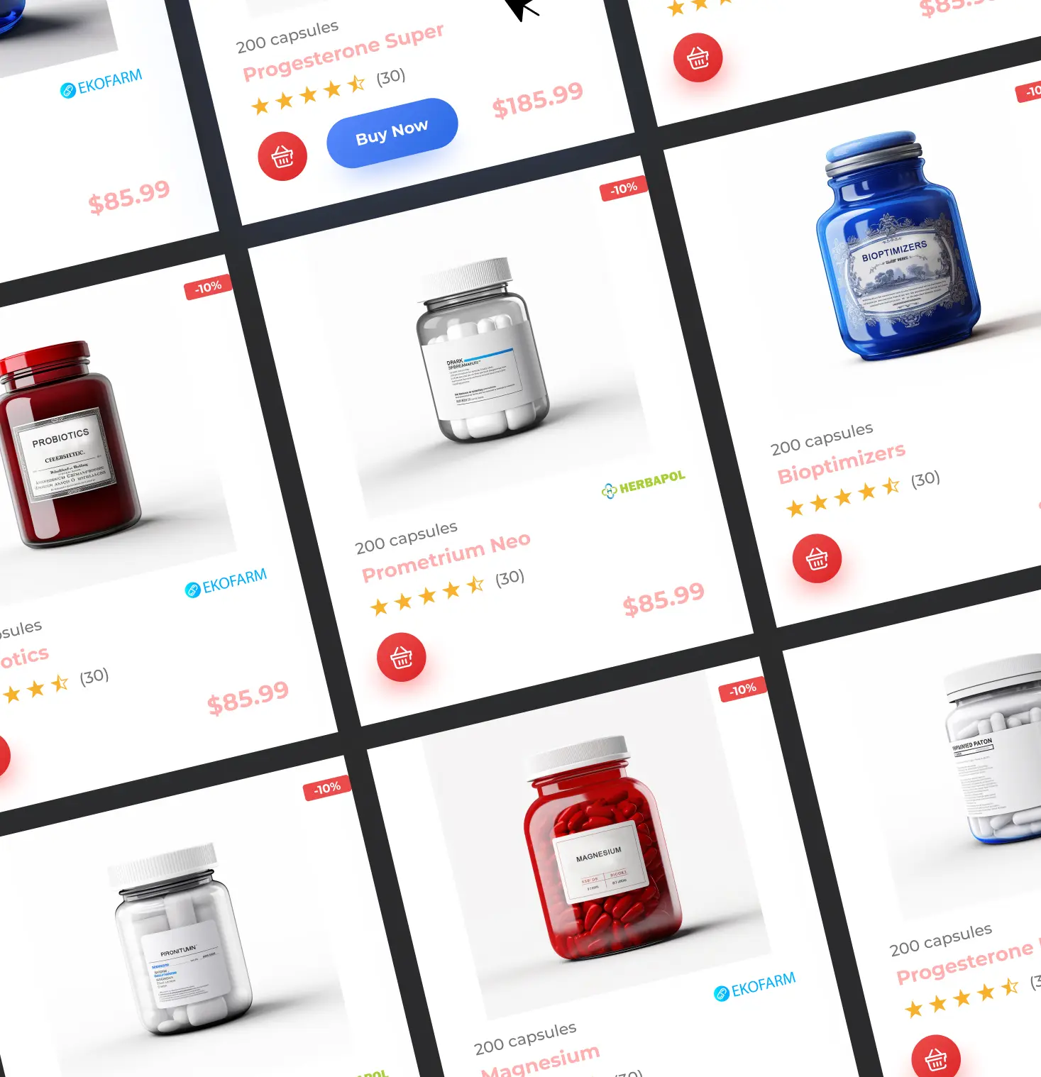
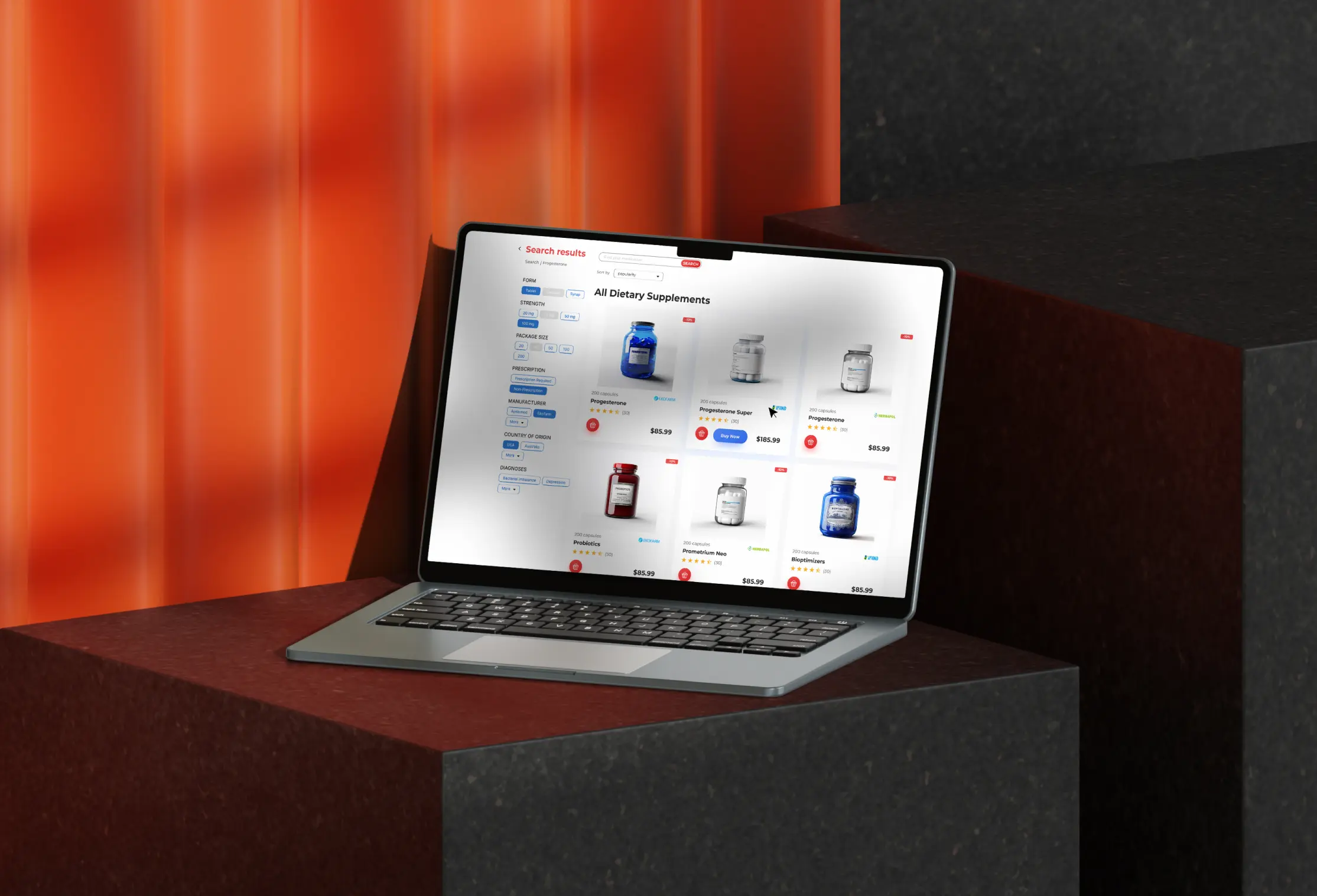
The platform’s visual design is clean and minimal, allowing users to focus on content without distractions. A neutral base of white and light gray keeps the interface airy and easy to navigate. Branded accent colors - blue and red - are used strategically to guide attention and reinforce trust, as they are commonly associated with healthcare among the target audience.
.webp)
.jpg)

